The late 2016 site refresh

You may have noticed a few minor changes around here today. I’ve taken steps to improve usability and help readers find what they’re looking for.
Since 2012, alexroddie.com has had a static landing page – a simple screen explaining who I am and what the site is about. During a major redesign in 2015, in which I ported the old Blogspot site over to the self-hosted WordPress installation I’m still using today, I made the decision to shift much of the navigational content right down to the bottom of the page, and ditched the conventional sidebar completely. That design has held up well, but I have become aware that an improved reading experience made discoverability suffer a little. Readers sometimes found it hard to find the right article.
Today I have removed the static front page. Despite the many purposes alexroddie.com fulfils – portfolio, business card, point of contact for potential clients – it primarily remains a publishing platform. Most of you come here to read the free content I have been publishing since 2012. With that in mind, what was the point of the static home page? It just added another click before readers could get to the good stuff. In reverting to the classic article list, I’m making it much easier to find recent content.
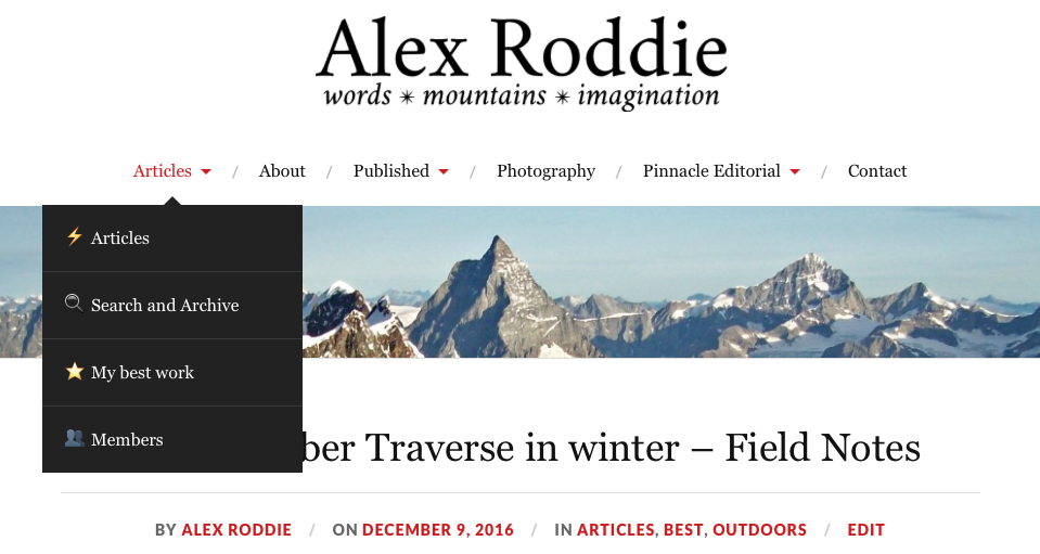
I have also revamped the UX for finding old posts with a new Search and Archive page, replacing the increasingly unwieldy chronological archive. The new page, linked from the main menu, contains a simple search bar and a list of every single article to have been published here since the 2012 relaunch. The old handpicked page has been removed – it had to be updated manually, which in practice I kept forgetting to do – and instead a shiny new automated page of my best work has been introduced. If there’s demand for it, I may add similar pages listing all of my book and product reviews.
That’s about it. 2016 has been a year of growth for my website, and although I haven’t always been able to post as frequently as I might wish, I’m glad that my focus on increased quality has begun to pay off. Thanks for being a reader, and special thanks to my members for continuing to support my work here.
Additional remarks 10/12/16
Today I made a few final tweaks to the site’s template. It had been bugging me for a while that post titles and meta information were left-justified, rather than centred like everything else, so I delved into the CSS and made the necessary changes. I’m sure you’ll agree it all looks a lot nicer with all the headings centre-justified! Additionally, I have changed the default typeface from Crimson Text to Georgia. Why? I’ve always liked Georgia – it’s a highly readable font – and I fancied a change.
Finally, I have made some changes to the top menu system on the site. A revamp has been on my list for quite a while. As another step towards the goal of aiding discoverability and improving navigation, I have added emojis to the submenu items. I know, I know, people dislike them in a ‘serious’ context, but adding clear icons does improve navigation. Adding them to the top-level menus would be a step too far, though.

Alex Roddie Newsletter
Join the newsletter to receive the latest updates in your inbox.


