ViewRanger is becoming a social network

On Friday, the ViewRanger team published a new blog post called Introducing the ViewRanger Activity Feed. The best digital nav tool for hiking and hillwalking is becoming a social network. Here’s why I think this is a bad idea.
What makes ViewRanger great
ViewRanger is a precision tool for mountain navigation. For years, I have relied on it for planning routes, accessing digital maps in the field, and many other navigational tasks. It has never completely supplanted map and compass for me, but it has come close.
VR’s strength is in its blend of power and (historically, at least) focus. It has never been a simple or minimal app, but its complexity was hidden beneath an easy-to-use interface that allowed the navigator to focus on the map. Digital navigators want fast and fluid access to global mapping, accurate and stress-free track logging, the ability to poinpoint their position on the map, and a way to store a library of routes. That’s pretty much all we need. Anything else is just clutter.
But ViewRanger is evolving, and I’m sorry to say that it is starting to succumb to feature bloat.
New features
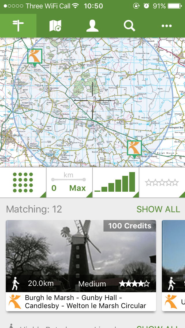
First, ViewRanger added a ‘route store’, accessed by a permanent tab at the top of the interface. I found this annoying, and have never used it, but it wasn’t hard to ignore – so I’ve ignored it.

Second, they added SkyLine. This is actually quite innovative (I wrote a quick review of it here late in 2016) but I object to the fact that it has a permanent button on the main map screen. The button occupies precious screen space and is impossible to remove. Since my initial testing of SkyLine, I have not found the need to use it again, and my opinion has cooled somewhat – I now see it as little more than a gimmick with only occasional real utility. I strongly think there should be a way to remove the SkyLine button from the main map screen for people who don’t want to use this feature.
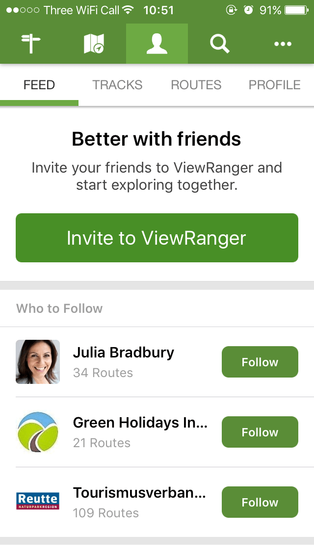
The latest new feature is the addition of a social feed. The very idea of this fills me with horror.

I know some people will welcome the feed, but the last thing I want is for my navigation utility to start demanding likes, shares, and comments – for the digital equivalent of map and compass to become yet another attention black hole. I do understand why they feel they need to do this. The market is moving in the direction of everything becoming ‘social’ (to generate more traffic, more users, and more marketing data for the companies), but I hate this trend and as a matter of principle I won’t use services that jump on the social bandwagon for no good reason.
Erosion
Some people object to GPS navigation, claiming it erodes navigational skills. While I don’t agree, I do think that the addition of a social feed in VR may actually cause this to happen in the long term. When an endless feed of other people’s routes is only a tap away, there is less incentive to plan your own. A few years ago, if you wanted to access a route somebody else had created, you had to download it onto your device manually. It required intention and conscious effort. Now you just tap and scroll and dozens of routes appear for you to follow without engaging your brain at all.
I know, I know; people have been doing this for years, by following routes in magazines or guidebooks. But this is completely different. This requires little conscious thought, and the logical next step is for a future ViewRanger AI to start recommending – even planning – routes for you, with no input from you whatsoever.
Will it happen? Maybe not, but I’m willing to bet that in a few years this new feature will arrive in an app update. And this is a line in the sand I will never cross. I’m not afraid of new technology, but I refuse to allow machines to do too much thinking for me.
How do we fix this?
I have emailed ViewRanger to ask them to consider putting a switch in the settings that would allow users to deactivate these features if they don’t want them. Judging by the response on Twitter, many other VR users share my point of view. Please, if you don’t want to see your favourite nav app become a social network, consider emailing the company and making your views heard.
Let me switch off these features and I’ll be happy. But I refuse to use a navigation app that forces me to participate in yet another intrusive, attention-hungry social network – I find the existing social networks I participate in exhausting enough as it is. ViewRanger may be the best in its class, but if it continues down this path then I will stop using it.
Update – response from ViewRanger
I contacted ViewRanger directly with my concerns, and received an in-depth response. While ViewRanger preferred that the actual content of our email conversation remain off the record, here’s the gist of it:
- The company is committed to the new social side of the app, and claim to have a lot of data based on research and user feedback to justify the need for it.
- There are currently no plans to make the feed something users can deactivate. The primary objective of this feed is inspiration.
- The new social features have been designed to be as unobtrusive as possible, and ViewRanger takes these considerations very seriously – they are absolutely focused on the core navigational duties of their app.
- The developers assure me that the feed won’t have a meaningful impact on battery life or data usage.
- Feedback from established users is being taken seriously. I’ve been assured that all comments about new features are being passed to the relevant authorities within the company.
Fair play to ViewRanger for responding to my concerns so thoroughly. I’ve always found the company a pleasure to deal with, and while I don’t agree with them in this instance, I am at least satisfied that user feedback is being taken on board.
Alexroddie.com relies on support from readers like you. Please consider making a small donation on PayPal. Thank you!
Alex Roddie Newsletter
Subscribe here to receive my occasional personal newsletter in your inbox. (For the fun stuff, please consider subscribing to Alpenglow Journal instead!)


