Review: Thrunotes waterproof hiking notebooks
A collection of waterproof, pocket-sized notebooks for recording your outdoor adventures.
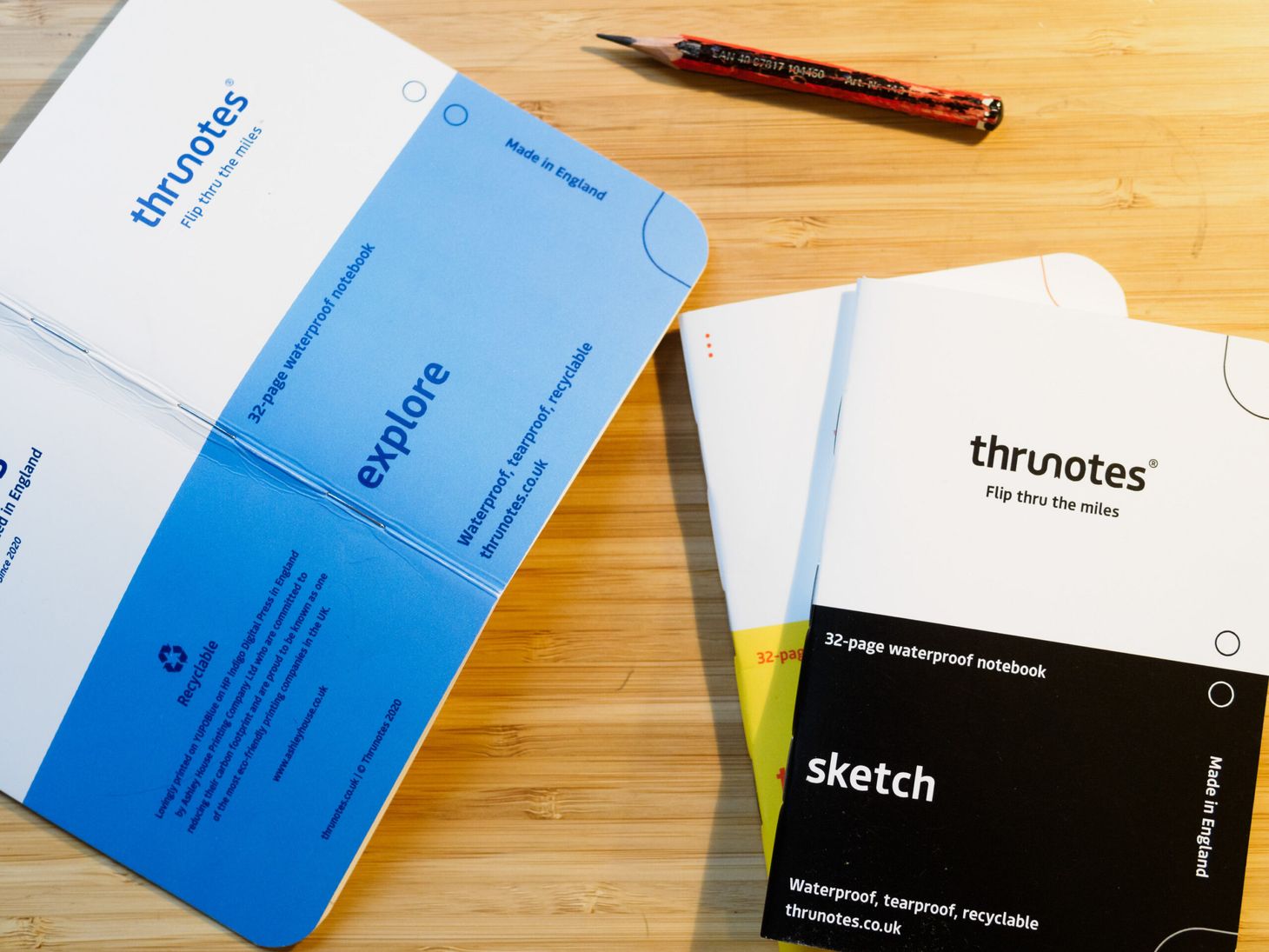
When I go hiking and backpacking, I like to be able to record the things I see and do throughout the day. Nature sightings, thoughts, snippets of dialogue exchanged with fellow walkers, even haiku — it all goes into my pocket notebook for writing up later in a bigger hardback journal. Although I take plenty of photos too, without this written record I find that many things slip my memory. Years later, reviewing these notebooks allows me to step back in time and relive many of my most rewarding outdoor experiences.
Walkers have carried pocket notebooks for centuries, of course, but that isn’t to say that there’s no room for innovation. When I first found out about Thrunotes, a new set of notebooks specifically designed for long-distance hiking, I was intrigued; although the price looked high, I noticed some interesting details that could prove very useful on backpacking trips.
A few weeks ago, designer Russell Hepton contacted me to ask if I’d be interested in taking a look at his products and providing some unbiased feedback. This review is a result of my initial testing and evaluation here in Lincolnshire. Due to the ongoing restrictions, I have not yet had the chance to use them on the trail.
These products were supplied free of charge by the brand in exchange for an honest review. Read my review policy here.
At the time of writing, Thrunotes offers four different designs of notebook.
Common features:
- Cost: £7.99 per notebook
- Dimensions: 130x90x4mm
- 32 pages per notebook
- Waterproof, tearproof, recyclable YUPOBlue paper: 116gsm for the interior, 200gsm for the cover
- ‘Ultralight’; measured at 25g per notebook
- Heat and UV-resistant
- ‘Bright colours, easy to spot’
- Vegan, compostable inks
- No added chemicals, coatings, adhesives, or PU laminates
- Made in England
- ‘Exclusive design’
- Rounded corners
- Saddle stitched
Overall impressions
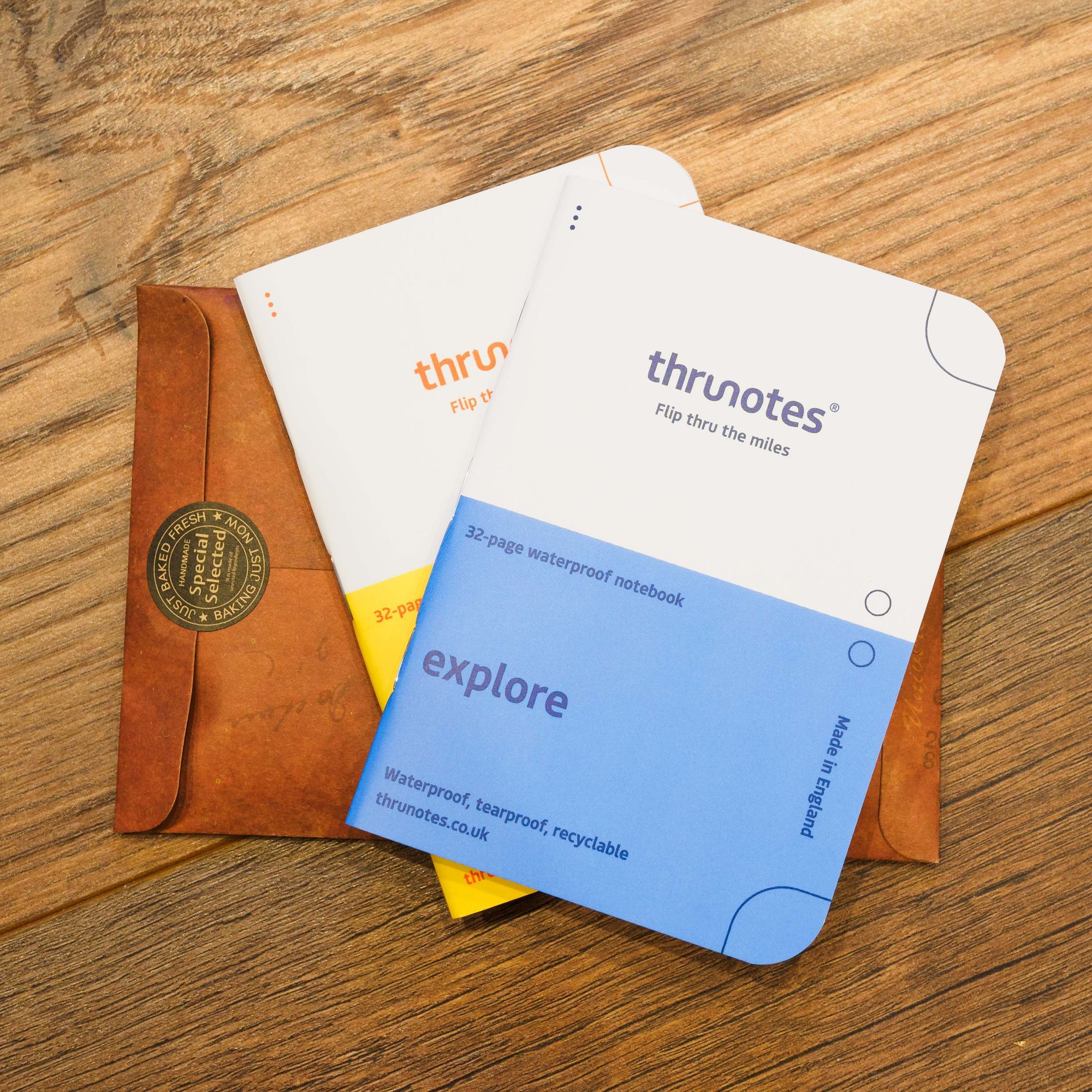
Presentation and quality are absolutely top notch. I was sent the ‘trailblazer pack’ of all four notebooks (£27) to try out, and the notebooks came in an attractive cardboard envelope. They look colourful, vibrant, and cheerful. Each notebook has a different accent colour, making them easy to distinguish at a glance, and the branding is subtle and tasteful throughout. I think the design looks really fresh and sharp.
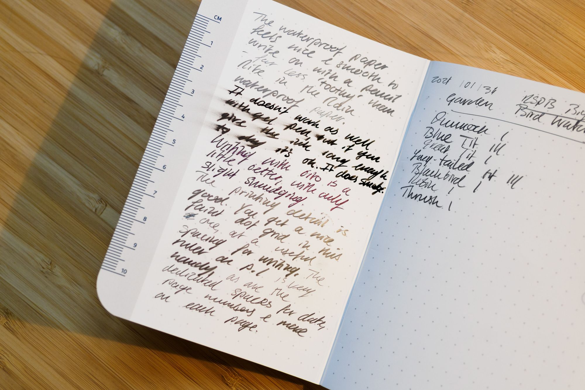
The synthetic waterproof YUPOBlue paper feels smooth, and is nice to write on with a pencil. It’s a lot less ‘toothy’ than the paper used in Rite in the Rain’s notebooks (perhaps the most obvious competitors). This means that your pencil will wear down less quickly. Of course, some people may prefer rougher paper, so be aware that this is very smooth. If you’ve used Harvey’s waterproof British Mountain Maps then you’ll have an idea of the feel to expect.
You can write in biro if you’re careful, but the ink will smudge unless you give it a few seconds to dry. Like most waterproof paper, it does not take gel pen or fountain pen well. The former will work if you give it several minutes to dry, but even then some smudging can’t be avoided. I recommend sticking to pencil. Pencil is waterproof and will never fade, so it’s a great choice for field notes.
The 116gsm paper feel durable, and true to the marketing I can’t make it tear. With use you will get creases, crinkles, and possibly some wear to the cover’s printing. This is fine; nobody expects notebooks to remain pristine in the field. These are certainly a heck of a lot more durable than the Moleskine Cahiers I used for many years, which often fell to bits after a week or two. The downside is that you can’t easily tear out pages.
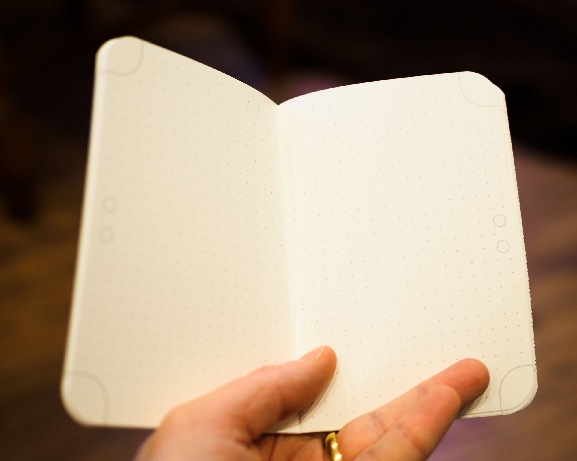
While the four different notebooks all have different design details, they have a few elements in common. On the outer edge of each page you’ll find two small circles in the middle (fill in one or both to highlight a particular day), and corners marked with an outline (for recording days and distance). I like this. It’s freeform enough to be flexible, and can adapt to your own needs — you could write page numbers instead of distance hiked, for example, or create a customised indexing system with different symbols drawn in the little circles. While my habit is to just number the pages and keep an index, this made me think about other ways I could set up my pocket notebooks.
Impressions on the individual notebooks
The thru
‘Get off the phone and flip thru the miles on your next thru-hike.’
This design was made specifically for recording a long-distance hike. It features dot-grid pages, each with a header at the top for adding the date, plus several special pages unique to the thru. There is a ‘trail register’ page at the very front where you can write down your name, the trail hiked, start and finish date, start distance and finish distance, units used (miles or kilometres), and an ‘if found’ contact email address. At the back, there is an instructions page, a page for emergency contacts and medical information, a page with room for three resupply locations (including pickup dates for each place), and a ‘contacts’ page for recording the details of people you meet on the trail.
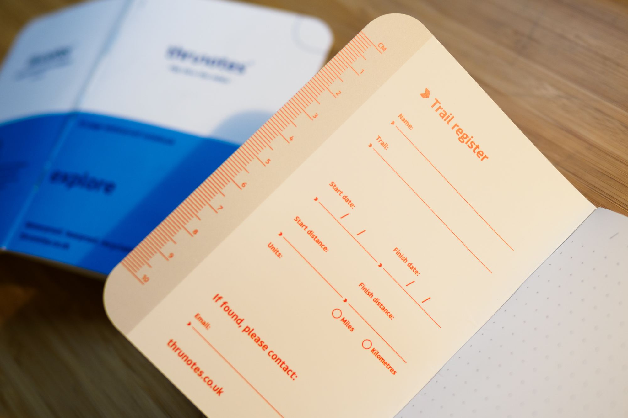
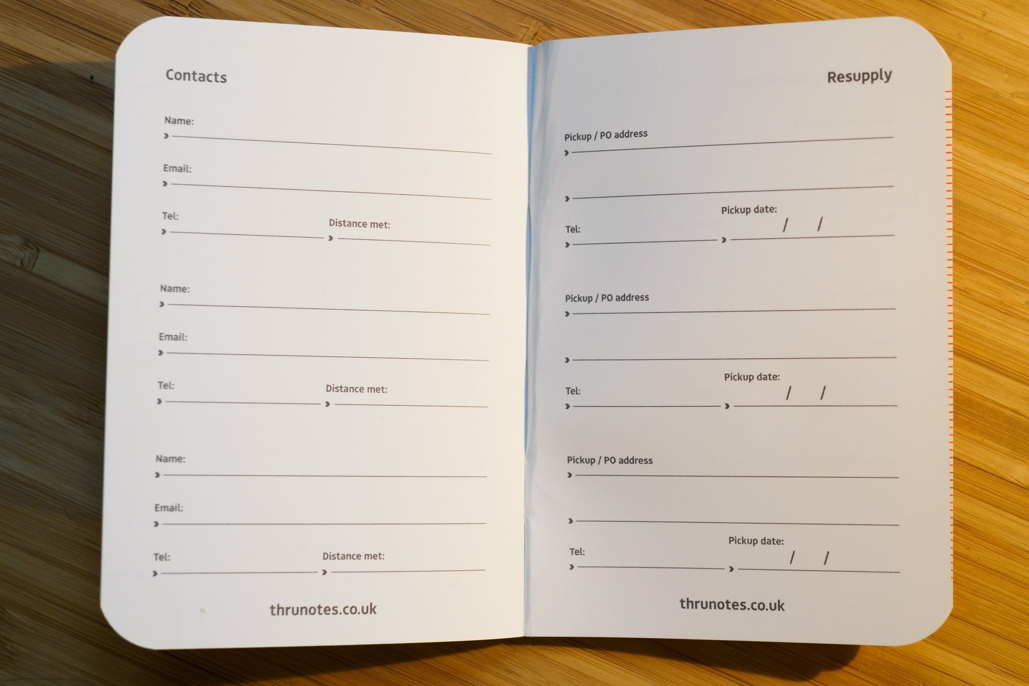
I think this notebook could be useful for people walking multi-day trails, but only if your habits fit the format. For example, if you need more than three resupply slots but don’t fill up all the main pages with notes, this won’t work out as well for you. Equally, if you tend to write a lot per day, you might fill the entire notebook in only two or three days, which makes three resupply slots overkill. I also think it’s a bit odd that the contacts page only includes fields for email, telephone and distance met, rather than (perhaps more common these days) Instagram or Twitter handles. There’s plenty of negative space on this page, so I’d like to see an extra line per contact for other notes.
For me personally, this format wouldn’t work. My habit is to keep a small pocket notebook for quick jottings during the day, then a bigger hardback journal that I write up in more detail each evening. I don’t keep information about resupply points, mileage or anything else in my pocket notebook. The thru fits in an awkward position between these two formats. If I tried to use it as a pocket notebook, the special pages for long-distance hiking would never get filled. If I tried to use it as my only notebook on a long trail, I’d fill about five of them per week.
Overall the thru format is a nice idea, but I think it will be a little restrictive for some people. If it works for you — say, if you expect to need no more than one page per day — then it could be exactly what you’re looking for. It could be ideal for people new to keeping a physical notebook on the trail, for example.
The explore
‘Journal or doodle any adventure on dotted pages.’
If the thru was not quite what you were looking for, then the explore could be worth a look. Essentially, it is the thru but stripped of its special pages. This design loses the trail register, contacts, resupply, emergency information and instruction pages that feature in the thru, and simply offers you a full notebook of lovely dot-grid pages with date headers and the same edge markings as all the other Thrunotes. There is a small owner’s information slot at the back, but otherwise it’s entirely freeform.
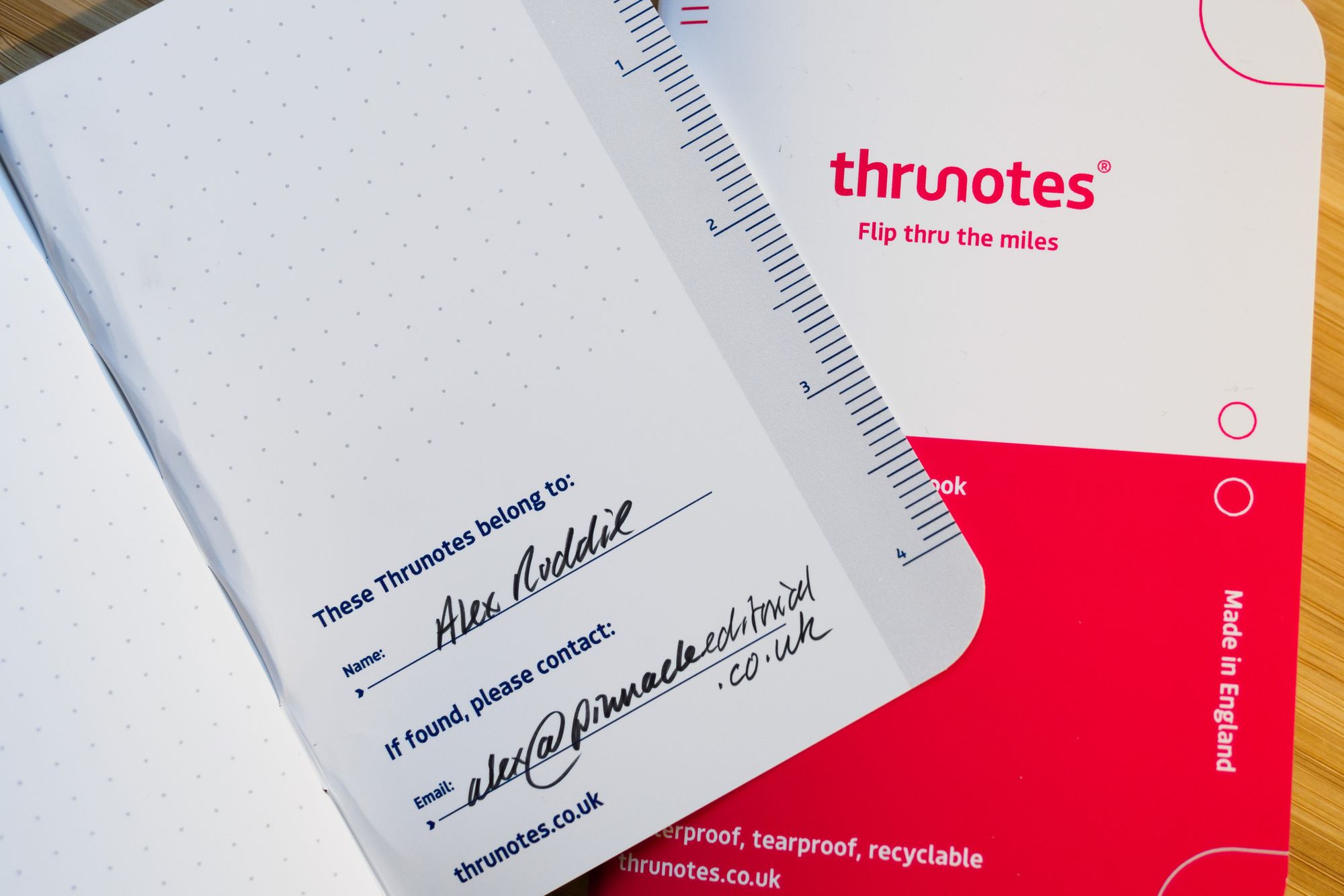
For me, this is a better design than the thru. You can still fill it with information about resupply points, emergency contacts and all the rest if you like, but because it’s freeform you can put this information wherever you want, and include as much of it as you want.
I would have no hesitation in using the explore as my pocket notebook on a long-distance trail. Although I personally favour the writing stability of a spiral-bound notebook, saddle-stitched pads are lighter, more flexible, easier to flip through, and easier to file. The Thrunotes explore feels nicer and more premium to use than competing waterproof notebooks. However, it is also more expensive than most.
The blaze
‘Blaze through your notes on crisp lined pages.’
The blaze is similar to the explore, but with lined pages instead of a dot grid. This is my least favourite design because, for me personally, the lines are too widely spaced at 10mm. If the spacing were 5mm (like the spacing for the dot grid) then it would be better. That’s a matter of personal preference, of course.
The sketch
‘Draw, sketch and doodle on pure white pages.’
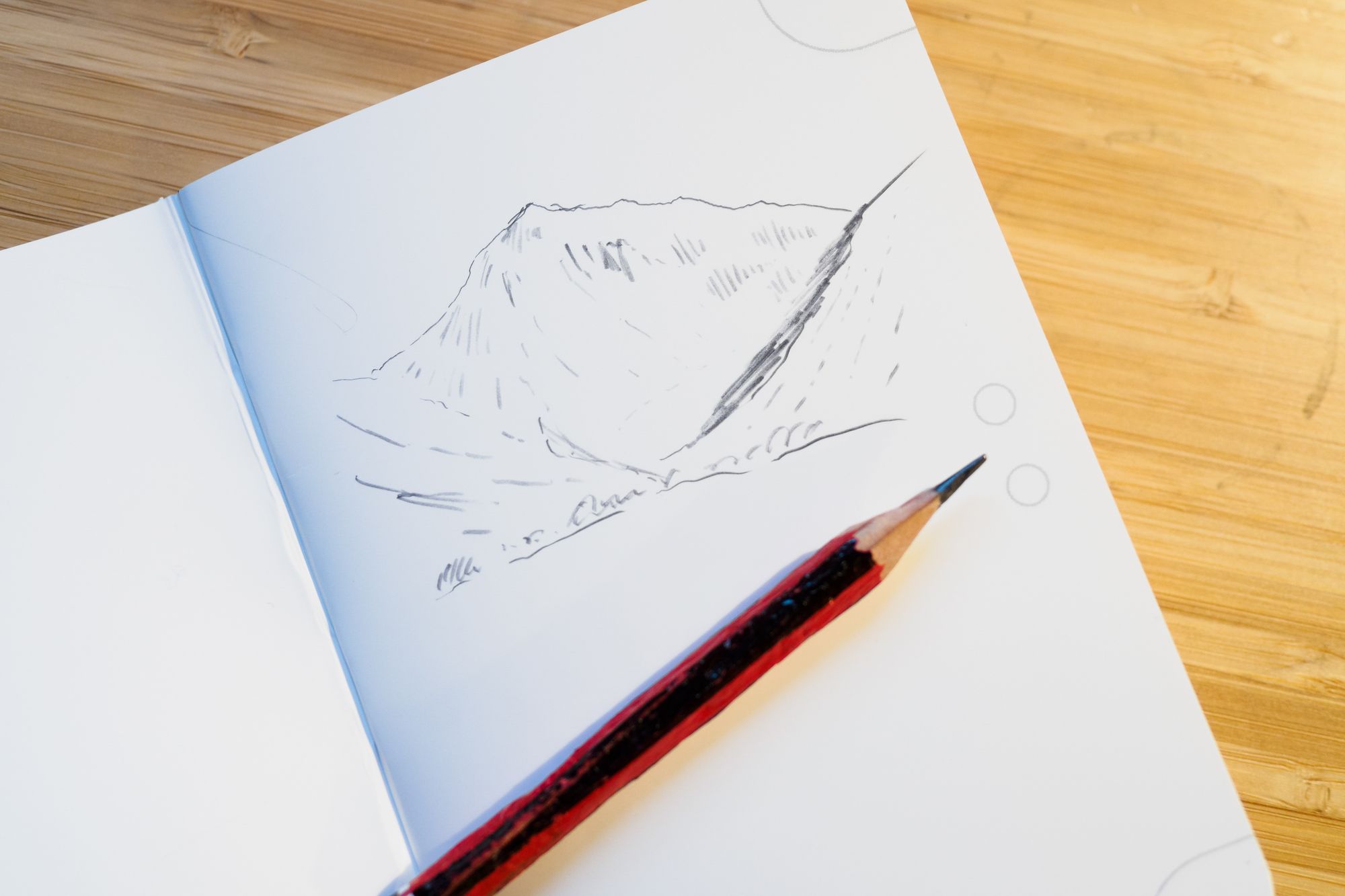
Finally, the sketch is similar to the explore and blaze, but with plain pages. If you like your paper clean then this design is close to ideal. It’s fab for sketching, as advertised, but also great for note-taking because you aren’t constrained by any lines or grids. I often choose plain paper for this reason. You have the freedom to really cram in a lot of information or keep your notes loose and flowing.
Final thoughts
I applaud Thrunotes for doing something different here, and certain users will find a lot to like. Quality waterproof paper, attractive design, British manufacturing with an emphasis on ethical materials and processes, and bespoke touches for the UL hiker — all these aspects are fantastic. I also admire what the company has tried to do with the more custom thru product, although I have doubts about its practicality for many hikers. The more freeform designs are excellent though and will be suitable for a wide variety of users.
The main downside is that £7.99 per notebook is expensive. If you prioritise price over design and presentation then you may want to look elsewhere. Putting aside an infinite variety of cheap-and-cheerful non-waterproof notebooks for a second, it’s hard to ignore competing options from Rite in the Rain. At the time of writing, paying just over half of this price will get you a waterproof spiral-bound pocket notebook with 50 pages. However, Rite in the Rain’s paper and build quality are inferior, and you don’t get the little design niceties for hiking use. They also aren’t made or designed in the UK.
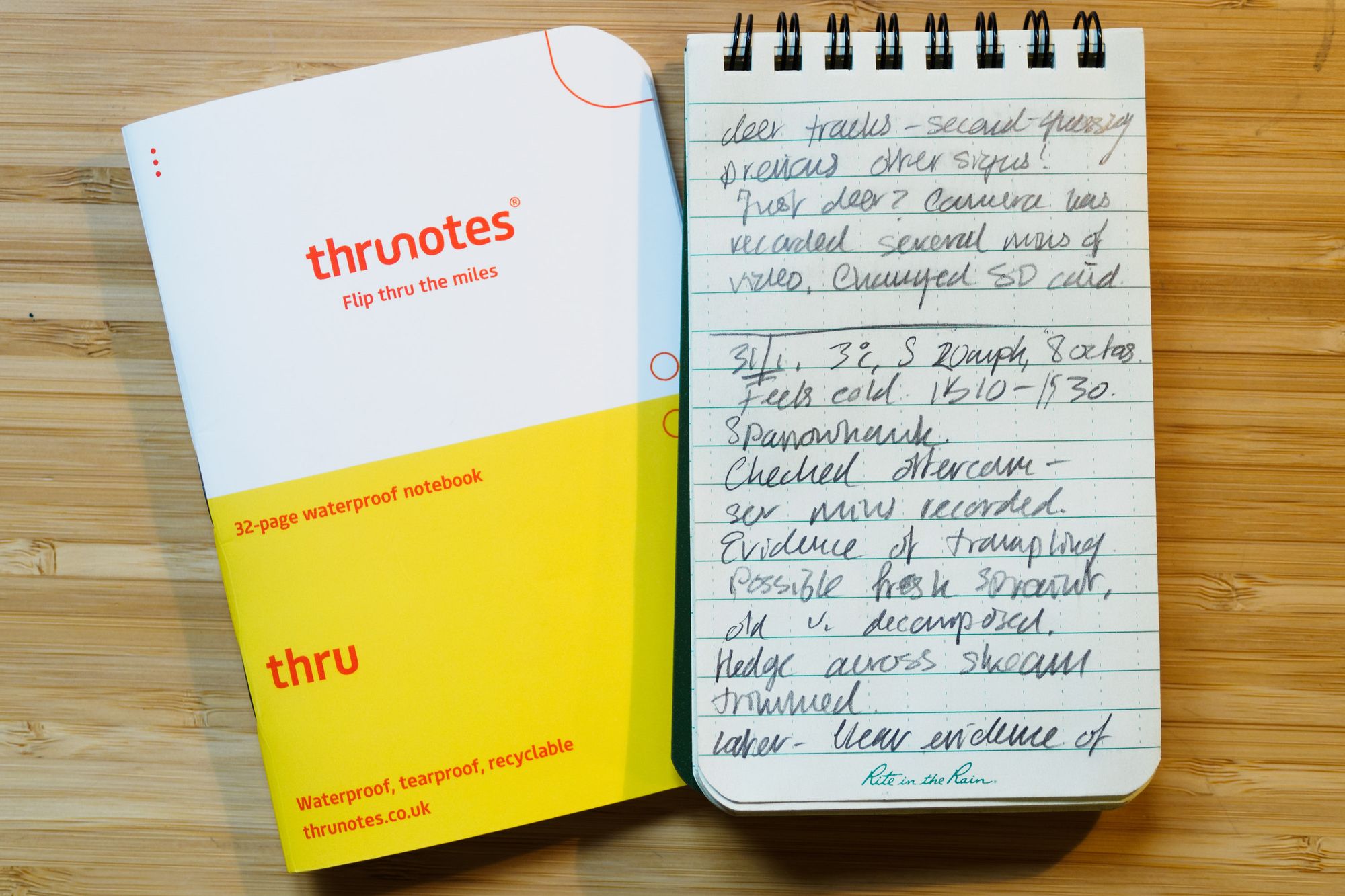
It’s hard to recommend Thrunotes as the best choice for most people at their current price, but at (say) £5.99 per notebook they would be more compelling. At the current price they are best for people with low-volume note-taking in mind, rather than — say — everyday use.
Finally, the marketing emphasises keeping analogue records rather than just using your phone. The products are marketed at the ultralight community, and UL hikers often end up using their phone for practically everything. This can result in a lot of screen time on the trail. While some people are fine with this, others — like myself — find that it can spoil efforts to be present and live in the moment. I like the fact that the company is presenting these products as an antidote to digital convergence. I find the simple act of writing my experiences down on paper to be of immeasurable benefit to me, and if these products introduce new people to the joys of analogue note-taking then that’s a good thing in my book.
Alex Roddie Newsletter
Join the newsletter to receive the latest updates in your inbox.


