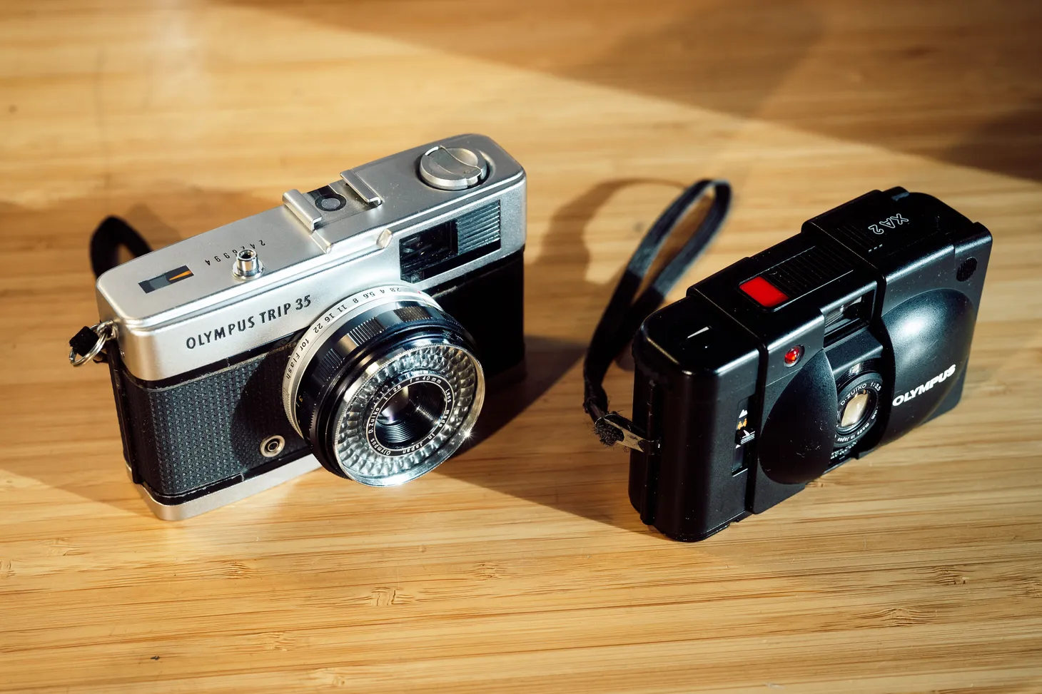
The magic of cine film
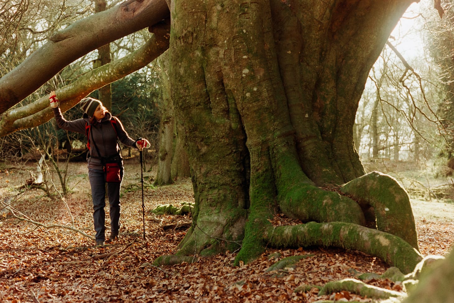
Sometimes, when the light is right, Kodak Vision3 250D can almost look like slide film. There's something magical about the way all film – real, tangible images that exist in physical space – captures the warmth of winter light, but I think Vision3 has something extra that bridges the divide between print negative and the rich colours of slide.
I've been using this very special cine film a lot over the last year. I shoot it in a 35mm stills camera, not a movie camera. Seven rolls in, I'm very much still on that initial learning curve, but I've learnt enough for my mind to be blown by how powerful and flexible it is. It is almost bulletproof when it comes to exposure. Like all print negative film, giving it more light is never a bad thing – I'll happily shoot it at ISO 100, and have seen good results at 50. That's more than two stops overexposed. It looks fine at 400 without pushing in development. I currently have a roll in my camera that I'm going to try pushing to 800. In my experience so far, it is just as flexible as Kodak Portra 400, but looks much better (subjectively).
One of the things I find so bewitching about Vision3 is how its look can be very different depending on light and subject. It's sometimes difficult to explain to digital photographers how analogue media can change its characteristics depending on numerous factors. This is no sterile, unfeeling slab of silicon. It breathes light. It behaves organically.
The slide film look
In good light, I like to underexpose slightly. If I've been shooting at ISO 100 all day I'll mentally recalibrate and try shooting at 400. The result is a rich velvety palette of colours that seems to glow in a way I rarely see from print negative film such as Portra or Ultramax.
Such results seem easiest to achieve during the golden hour. But sometimes good light at other times of day can have a similar effect.
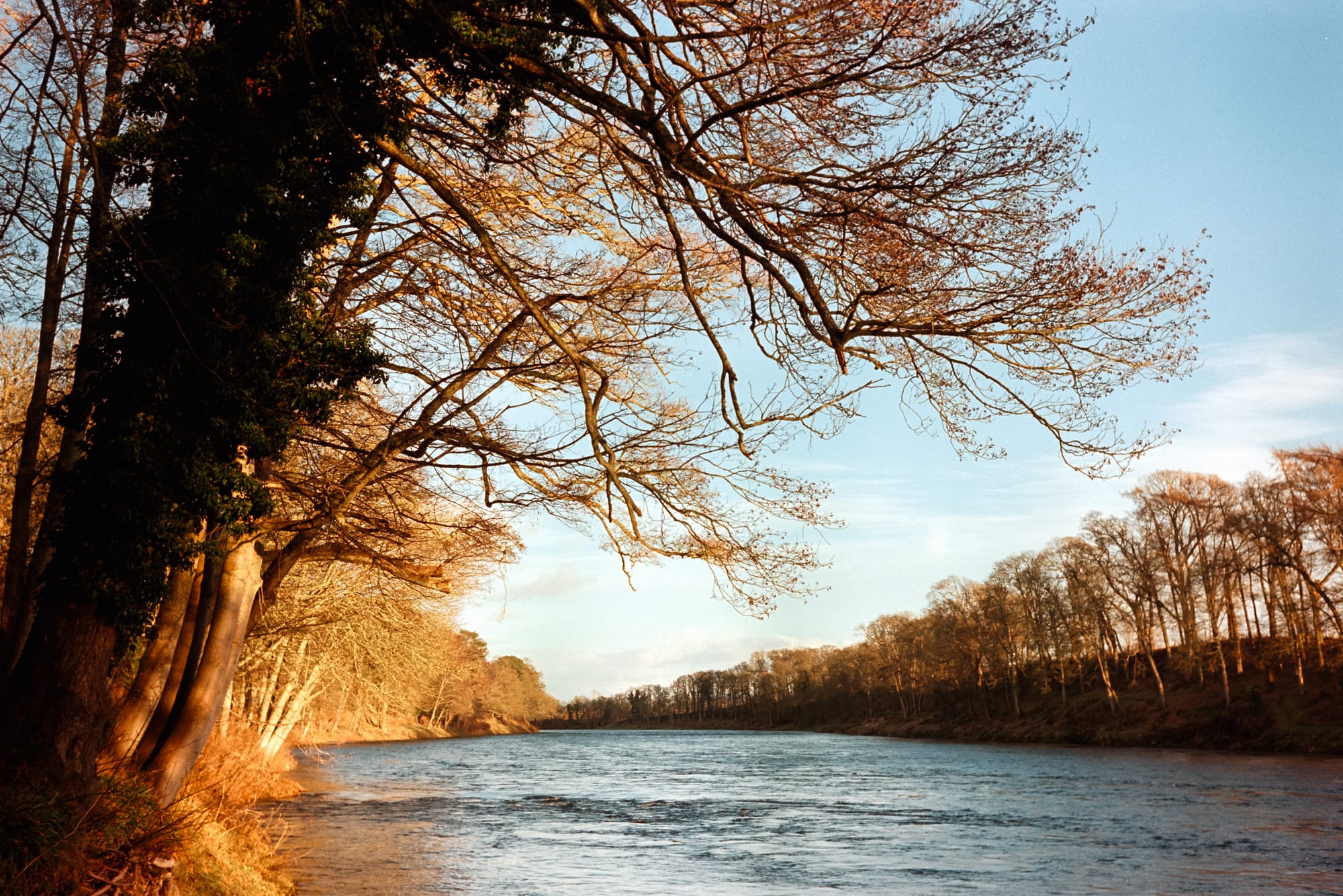
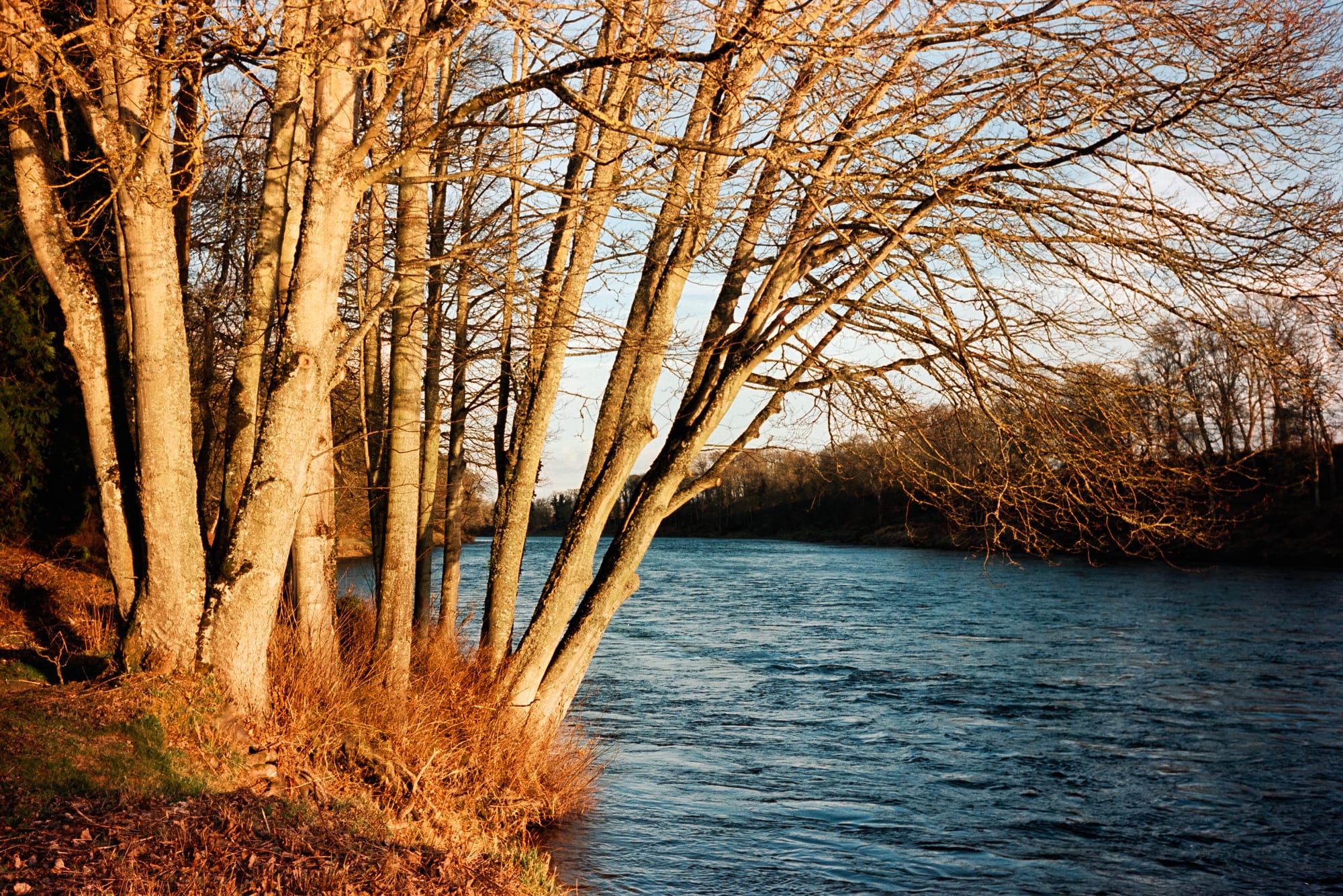

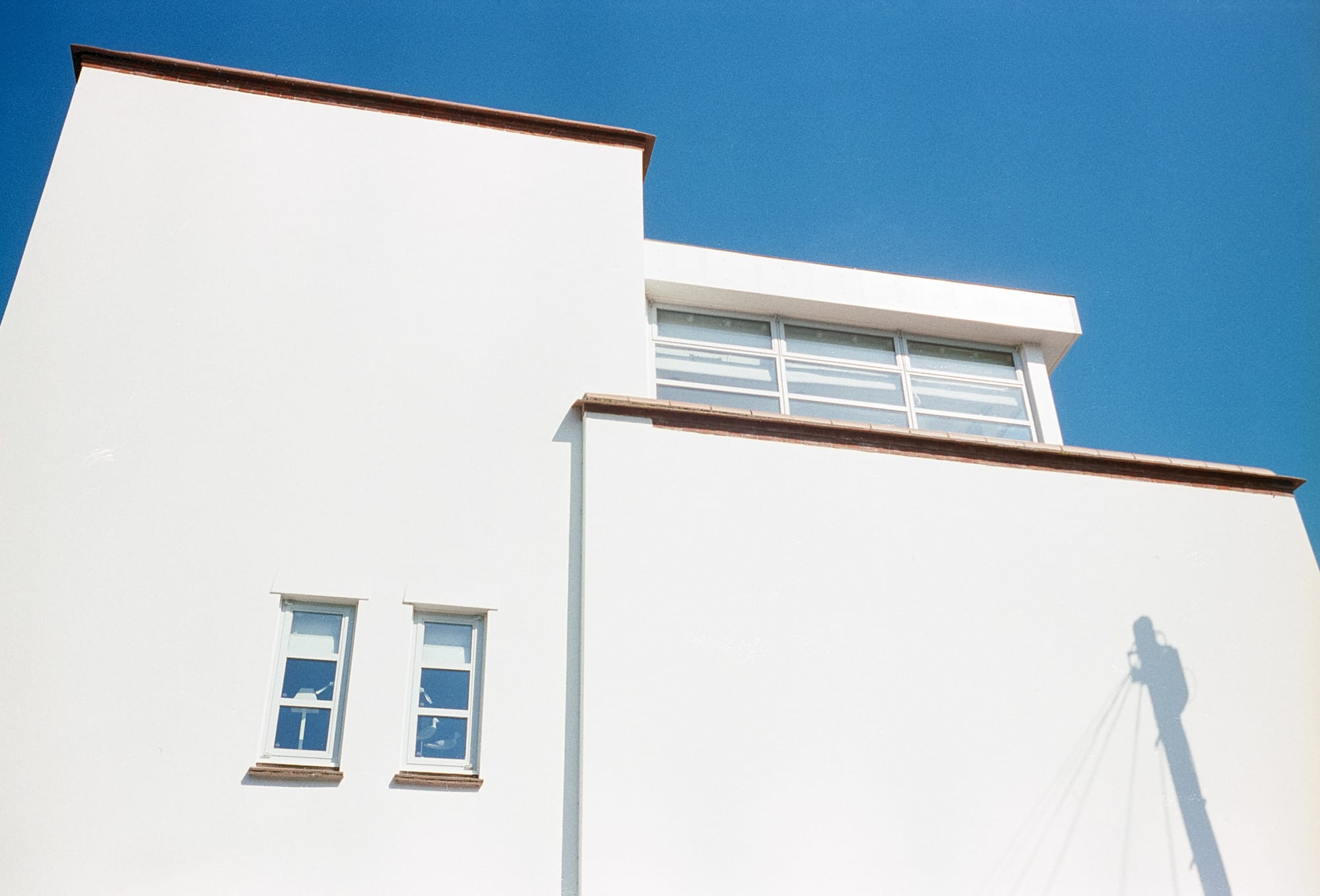

Kodak Vision3 250D, September 2023 to February 2024
I have not shot much slide film. It's expensive, and my film of choice (Fujifilm Provia 100F) is now pretty much extinct. But to my eye there is a similar ethereal glow – a similar richness and depth of colour. I have never been able to achieve anything like it in digital.

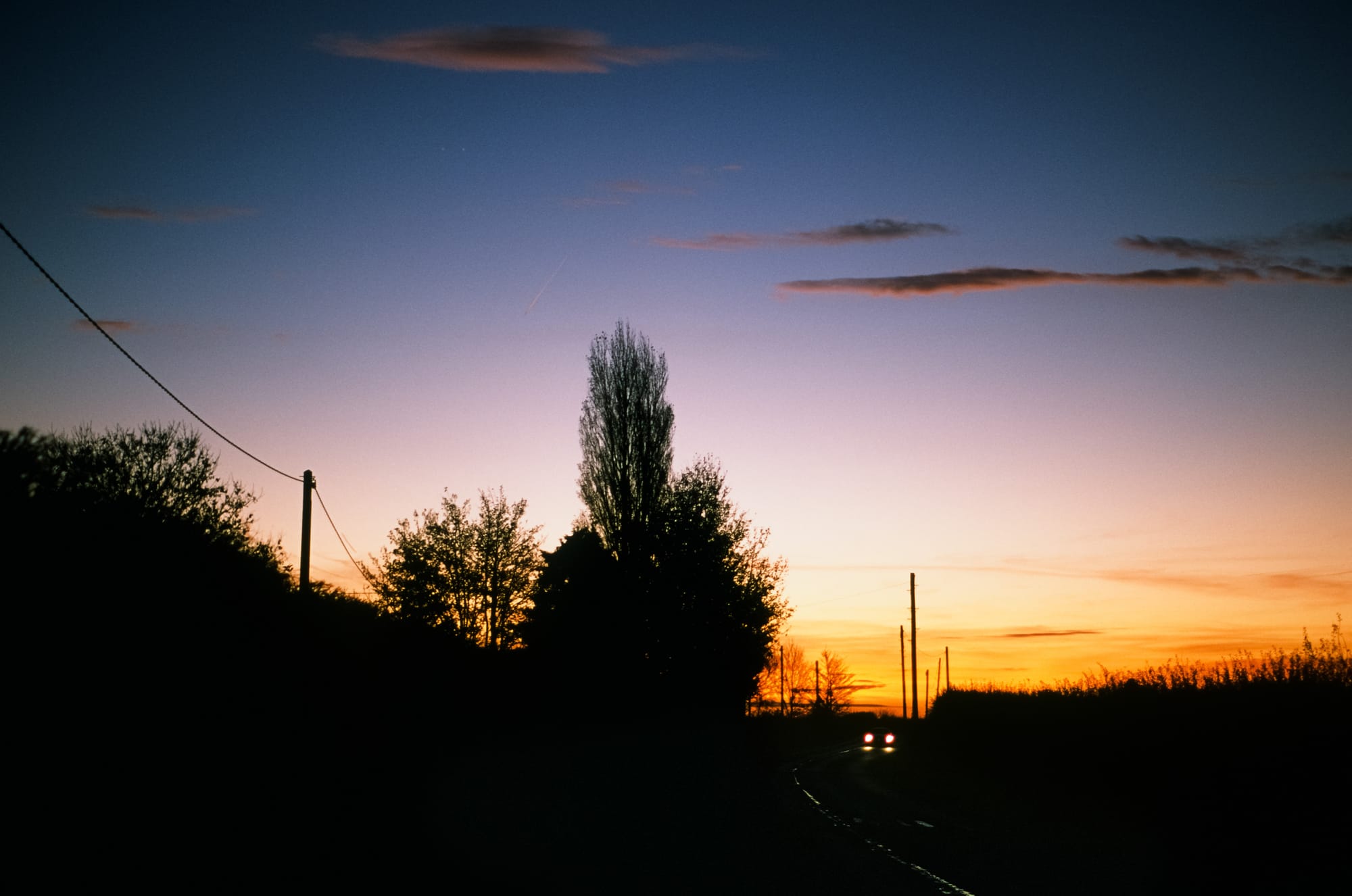
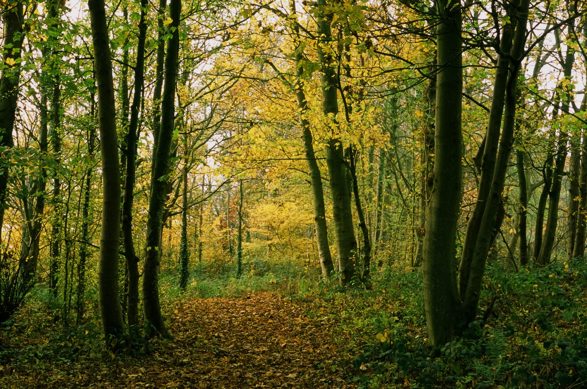

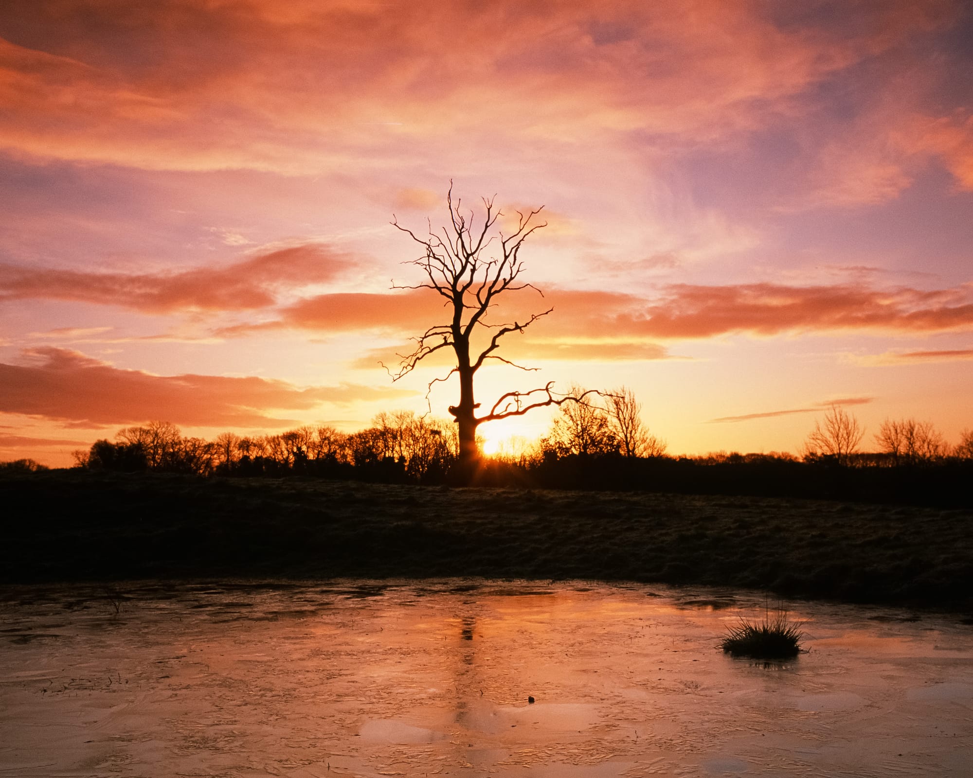
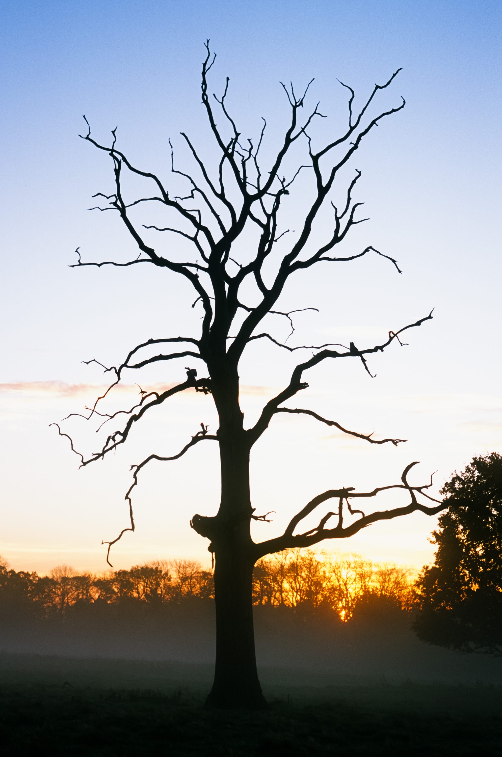

The perfection of Fujifilm Provia 100F. Various images 2018–2021
The softer look
I'm not quite sure what to call this look. Is it a pastel look? Maybe there's an element of that. It's lower contrast. Colours are still rich but toned a long way down in saturation. This look is all about subtlety and soft tones. The images are still sharp, but they don't have the same colour pop.
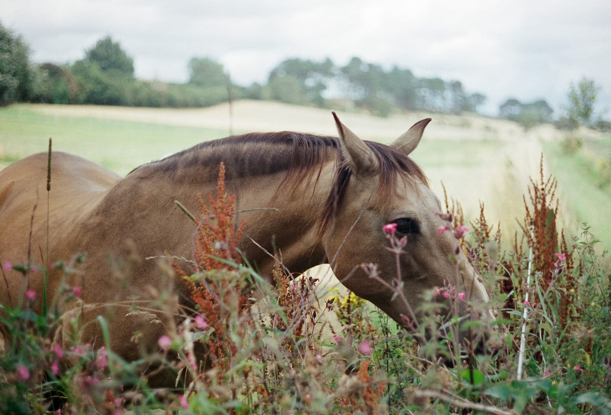
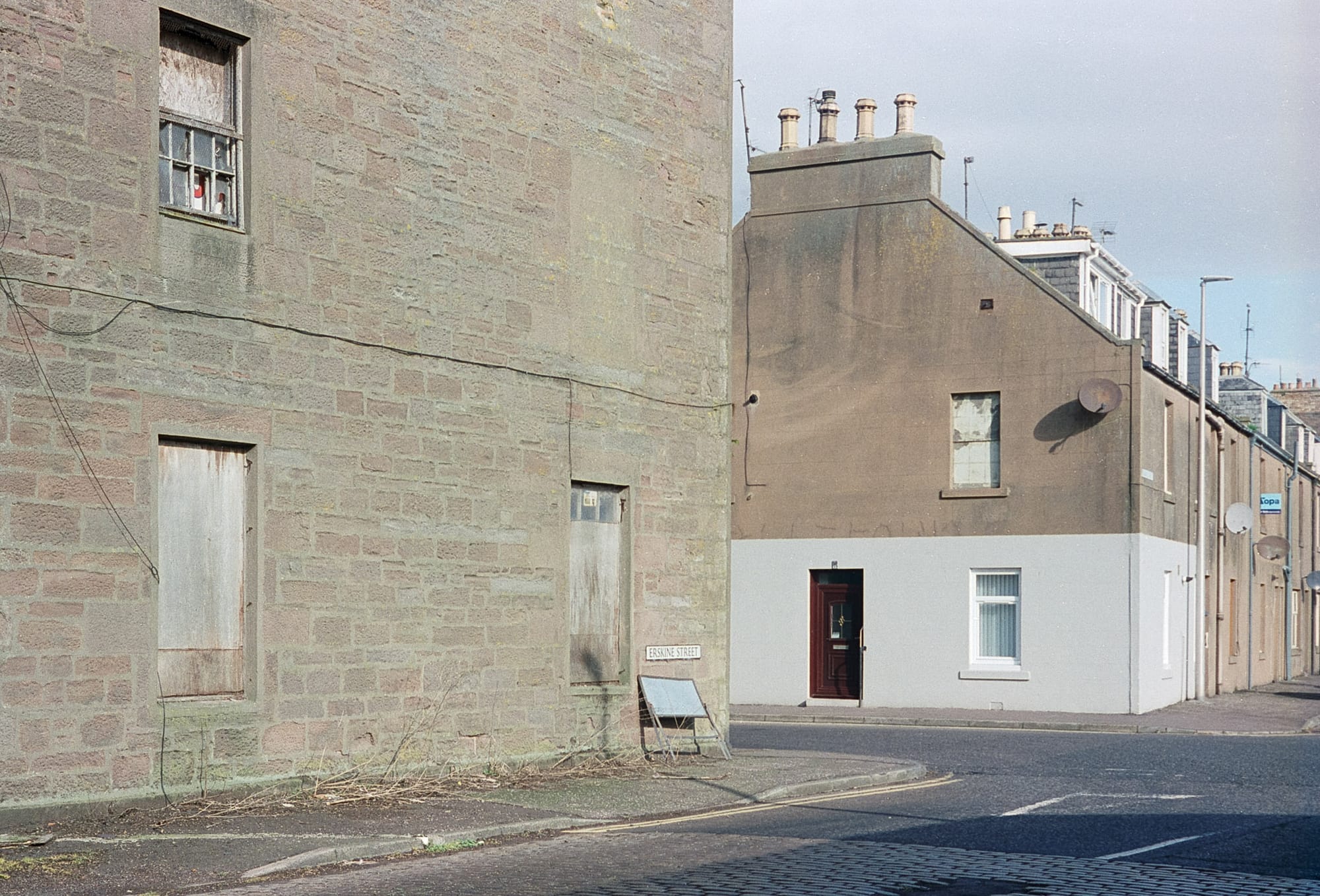
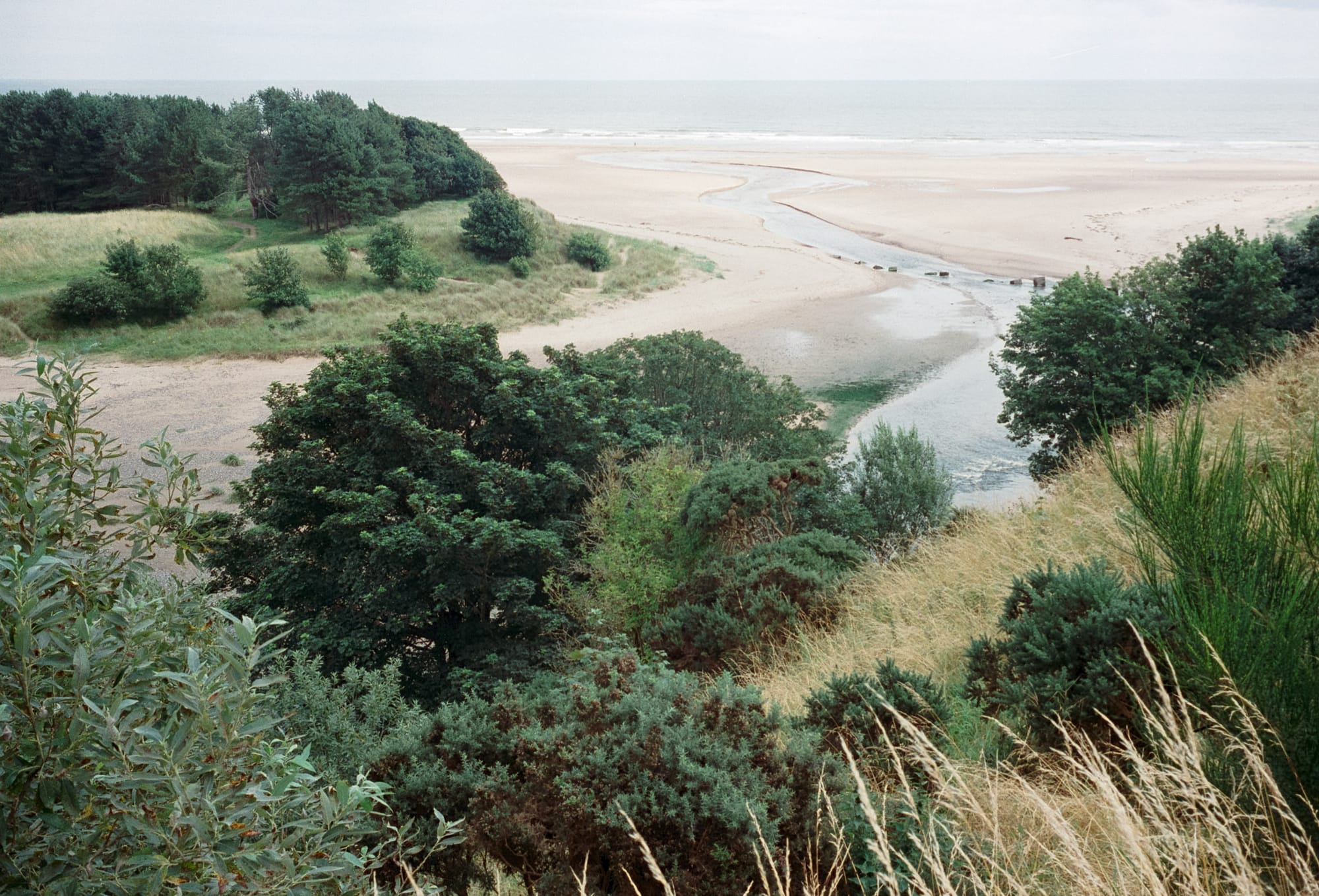
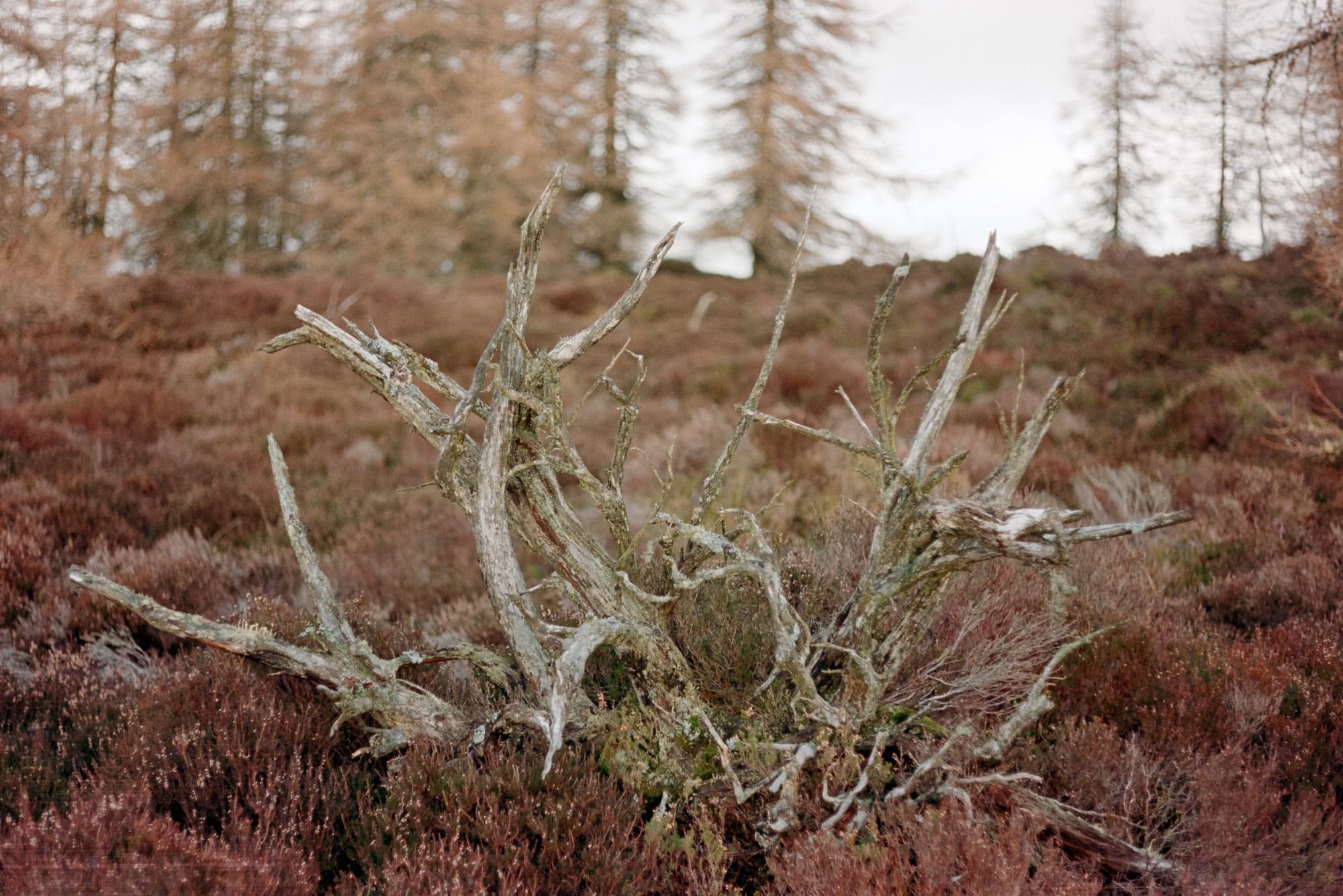
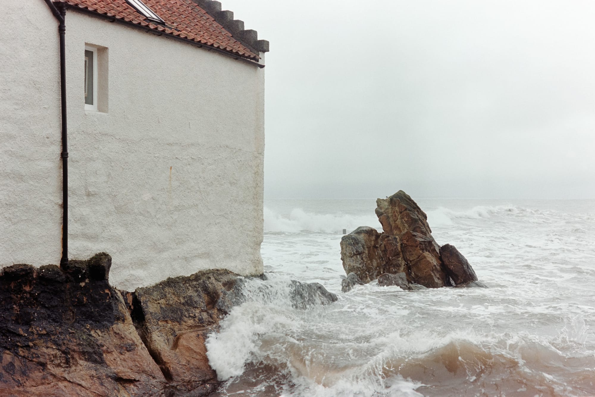
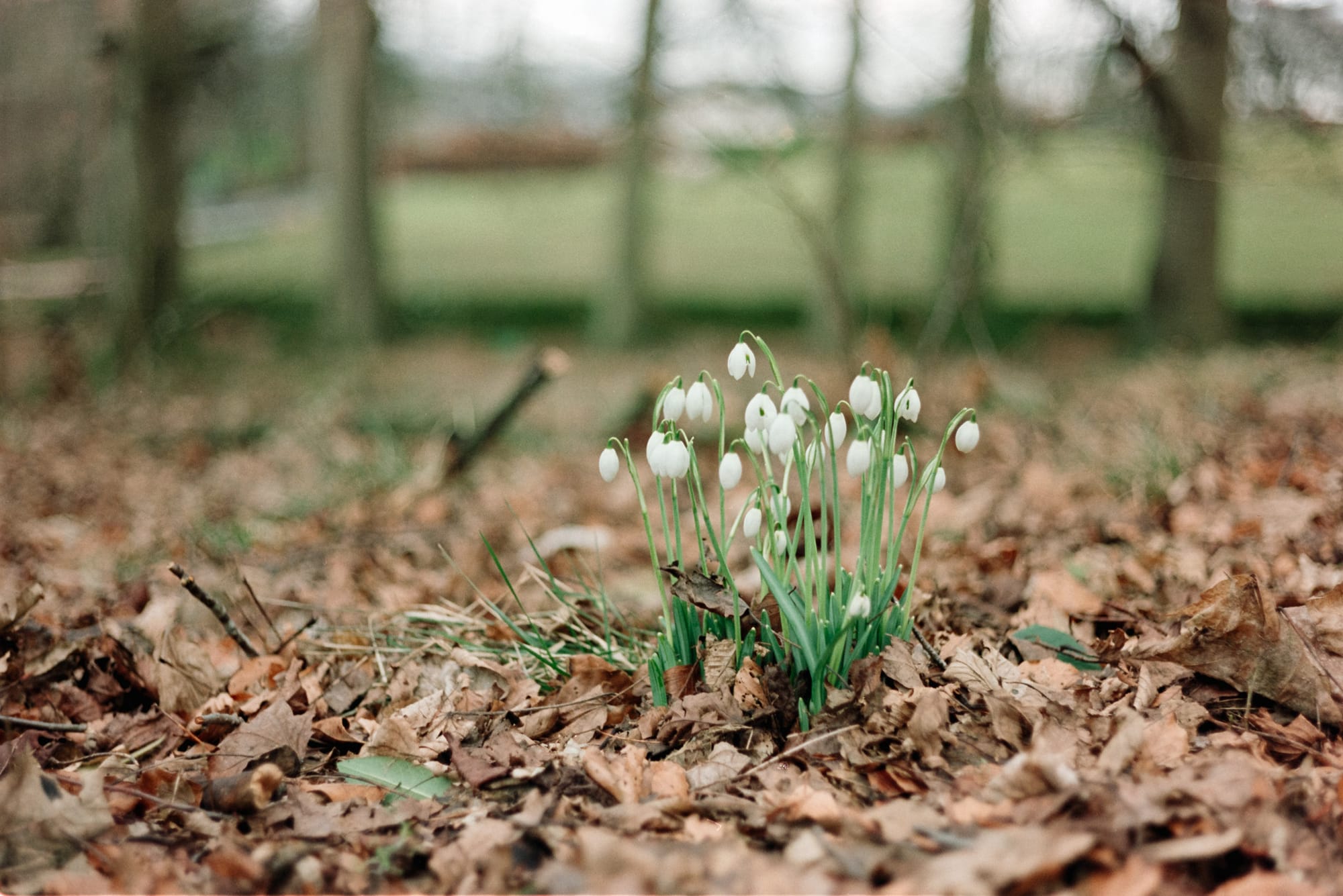
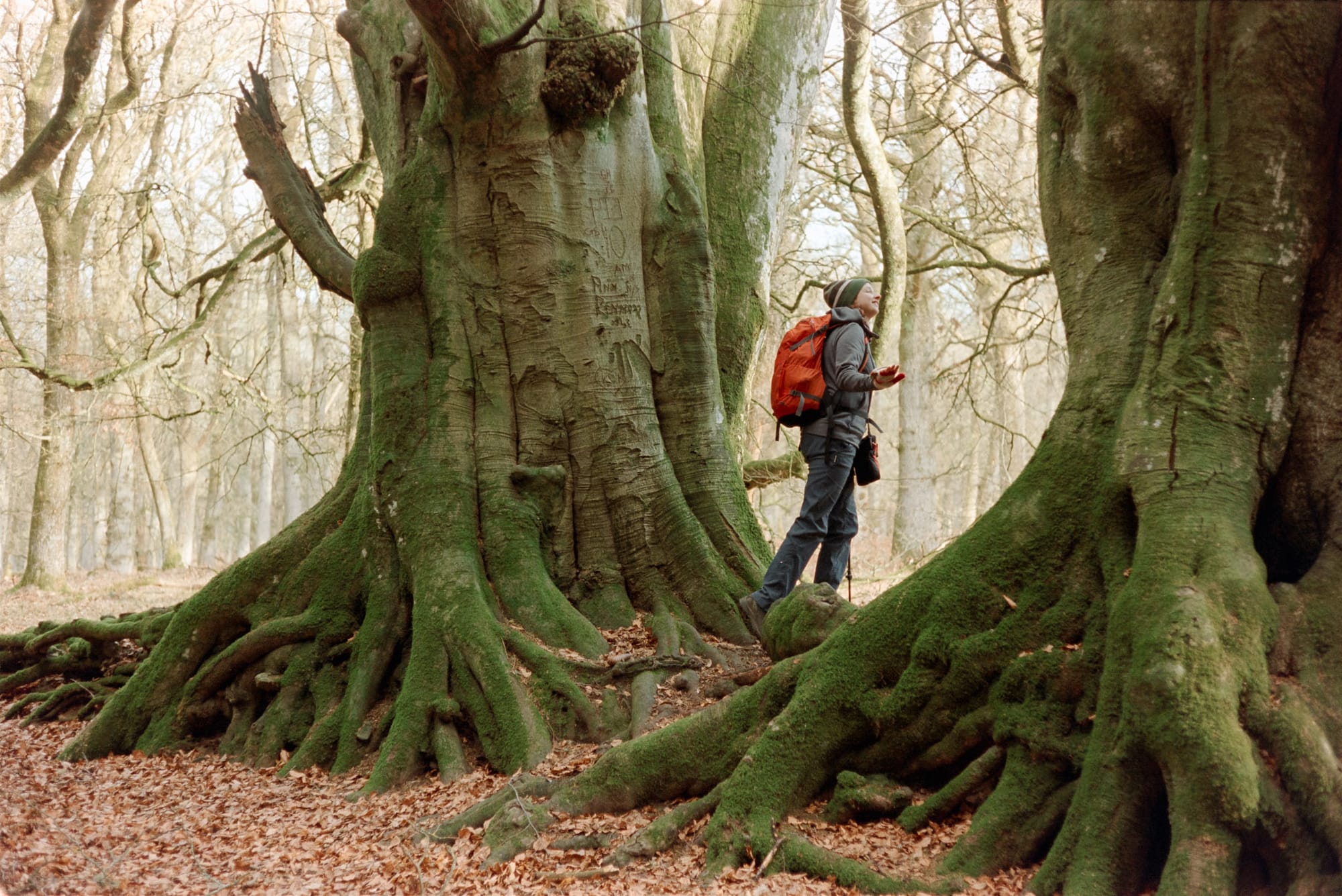
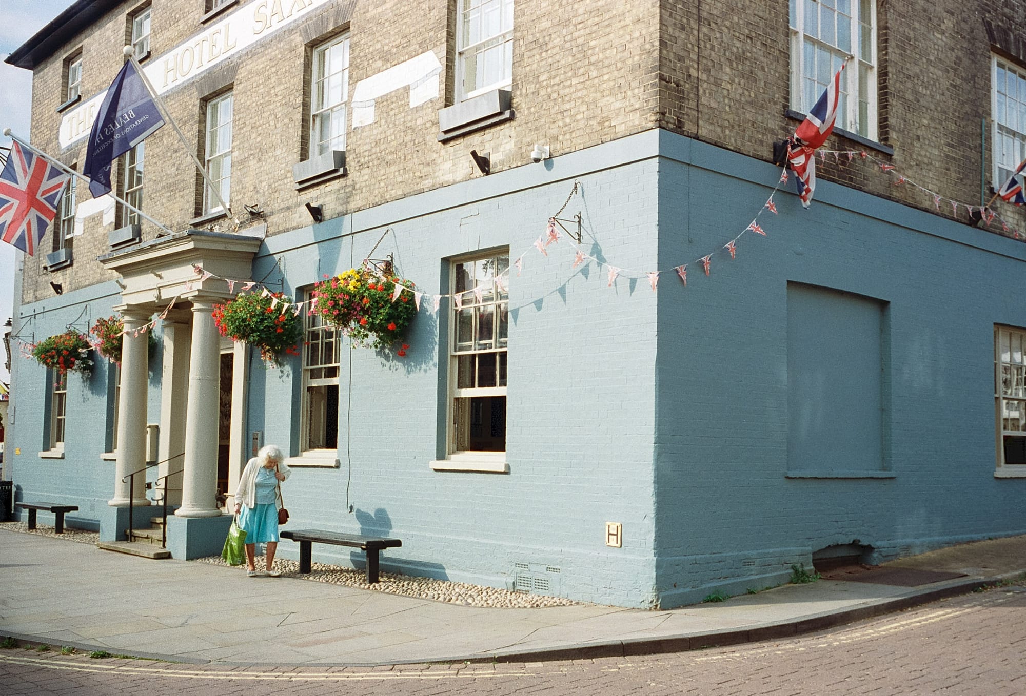
Kodak Vision3 250D. September 2023–March 2024
I like this as much as the slide look above, but it is very different. The question is: can you pull this off on purpose? The short answer is... I don't quite know yet! I think that this look rises to the fore when the light and colour palette of the scene are more muted... and you give the frame lots of light. It's as if the film takes the characteristics of the scene and then goes a step or two further. However, it feels very organic and some images seem to straddle both styles (see the last image in the set above). Perhaps certain colour combinations lend themselves naturally to this style. Greys, browns, pale greens.
I am still learning how to use this film to get the results I want. I tend to get better results from it than either Portra 160 or 400. I can only hope that prices of Vision3 don't go up as more photographers start to discover just how good it is!
All images © Alex Roddie. All Rights Reserved. Please don’t reproduce these images without permission.
Alex Roddie Newsletter
Join the newsletter to receive the latest updates in your inbox.

